
Why Timeline Makers Break at 20 Events (And What We Built Instead)
Most timeline tools feel fine when you're adding your fifth or eighth event. Then you paste in a school project's full event list — or a company history with forty milestones — and things fall apart.
Text overlaps. Cards jump to new rows because a label was too long. You end up nudging boxes in Canva for an hour. Adobe's timeline maker overflows off the page. Project tools force every item onto its own row until you're scrolling forever.
This isn't you doing it wrong. It's a category problem: most timeline software is a design canvas with dates pasted on, not a layout engine built for real lists of events.
I built Simple Timeline Maker specifically around the failure modes below. Here's what goes wrong elsewhere, and what we did instead.
Pain point 1: Manual layout doesn't scale
The problem: In Canva, Visme, and most "timeline templates," the axis is decorative. You drag rectangles until it looks okay. Add twenty events and you're doing layout work by hand — exactly what you wanted to avoid.
Adobe Timeline Maker looks promising until you load a real dataset. Users report text running off the page, no pagination, and PNG-only export when the layout breaks. The tool doesn't resize or reflow — it just overflows.
What we built: You enter events (or import CSV / paste a list). The layout engine assigns rows, compresses spacing as the list grows, and paginates automatically when a timeline exceeds one screen.

At 50+ events we switch to dense mode: tighter row gaps, smaller card padding, and description text clamped so cards stay predictable. You can export page by page or grab all pages as separate PNGs.
Try it with your own list — no account required.
Pain point 2: Same-date events and long labels break the row
The problem: Forum threads for Aeon Timeline, Retool, and Coda all describe the same bug from different angles: put two events on the same date, or write a long label, and the software bumps the next event to a new row — or misorders events entirely.
That's maddening when you're documenting parallel developments (two product launches in the same month) or legal chronologies where precision matters.
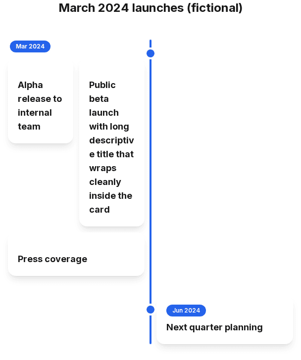
What we built: Events sharing the same sort date are grouped into one row (up to four side by side). Long titles wrap inside the card with break-words — they don't push neighbours around. Order within a row follows your explicit sort order.
Pain point 3: Undated processes get fake years
The problem: Story beats, onboarding steps, recipe stages, and workshop agendas aren't dates — they're sequences. Most tools force you to invent fake years (2020, 2021, 2022…) so the sorter has something to chew on.
What we built: Sequence mode treats order as the data. Steps are numbered. Reorder with move up/down. No fake calendar dates required.
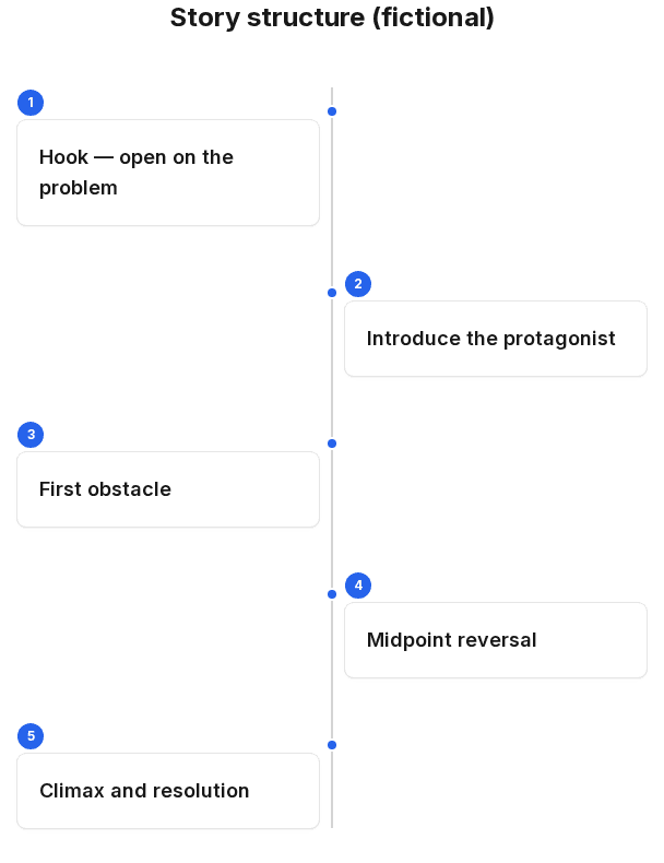
Open Create → Sequence mode to try it.
Pain point 4: History needs parallel tracks, not one long list
The problem: Real history runs in parallel. Roman politics, Chinese dynasties, and scientific discoveries don't take turns — they overlap. A single-column timeline hides that.
Preceden handles layers on paid plans. Timetoast and Tiki-Toki target this use case but require accounts. Spin Everything goes further for classrooms with compare mode — but it's a different product category entirely.
What we built: The Lanes style gives you parallel tracks in one timeline. Assign events to lanes like "Rome" and "China," or "Politics" and "Science." Date ranges render as spans where you've added an end date.
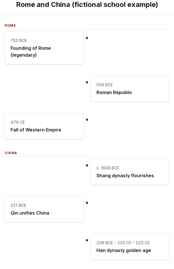
See also our history timeline guide and timeline examples.
Open Create → Lanes style to set up parallel tracks.
Pain point 5: Typing fifty events one by one
The problem: You've already got the list — in Notes, a Google Doc, a spreadsheet, or an email. Retyping it event by event is tedious enough that people give up or cut events to fit the tool's free tier (Preceden's ten-event limit, Office Timeline's ten-item cap).
What we built:
- CSV import — up to 200 rows, with optional Lane column for parallel tracks
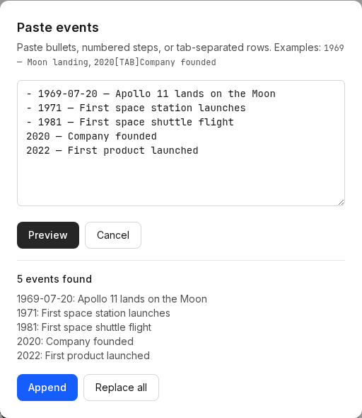
- Paste events — drop in bullets, numbered lists, or tab-separated rows copied from Excel (
1969-07-20 — Moon landingjust works) - Compare timeline — load a second timeline JSON to overlay a comparison track
What we still don't do (honestly)
We're not pretending to be everything:
- No Gantt dependencies or critical path — use TeamGantt or Microsoft Project for schedules that recalculate
- No PowerPoint-native editable shapes — Office Timeline owns that workflow
- Cloud save requires Premium — free tier work lives in your browser's local storage
- Free PNG export is per preview page — PDF, PowerPoint, and single-file exports are Premium (£12.99 once)
- AI document extraction — the API stub exists; structured paste covers most cases today
For a straight comparison of tools by job type, see Best timeline creators in 2026.
Who this is for
If you need a milestone graphic — school project, company history, project recap, story structure — and you have more than a handful of events, you shouldn't be hand-aligning boxes.
Simple Timeline Maker is built for:
- Students and teachers doing history projects with BCE dates and parallel regions
- Founders and marketers documenting company milestones without a designer
- Writers and PMs mapping sequences and processes that aren't calendar dates
- Anyone who's hit the wall at event fifteen in a generic template tool
Try it
No signup. Paste your list, pick a style, export PNG.
If something still breaks at your event count, tell us — that's exactly the kind of edge case we want to fix next.